Web design trends are constantly evolving, and as trends come & go, true best practices begin to emerge. For eons, using a slideshow/carousel as the main focal point of your site’s homepage was The Thing To Do. It has been accepted almost as a given, must-have element in the design process, as if on the web design 10 Commandments, “Thou Shalt Have Thee A Homepage Slider” was #2 on the list, sitting right after “Thou Shalt Place Thine Logo in the Upper Left” and before “Thou Shalt Not Use Comic Sans, for it is an Abomination Before the Lord.”
But the times, they are a-changing, and forward thinking, user-experience-focused geniuses like ourselves are starting to advise our clients to think twice about using one of the longest-standing, time-honored page elements in web design history: the Holy Homepage Slider.
Why Sliders Are No Longer Best for Web Design or SEO
More and more, we find ourselves recommending that the focal point of a homepage should be something:
- more functional,
- more engaging, and
- more conversion-oriented than a slideshow tends to be.
Instead of showing a rotation of several items that you feel may be of interest to users, we suggest using that priceless real estate to focus on your value proposition instead.
Here are a few reasons why:
1. Carousel Sliders Often Hurt UX (User eXperience)
Let’s think about a carousel slider from a user’s perspective. In most cases, a visitor comes to your site with the desire to answer one simple question: can they meet my need?
Therefore, the first content they see should be focused on your company/service/website’s ability to meet their most common, fundamental & universal need. Now, your beautiful homepage might actually be full of potential answers to the user’s questions (in the form of content ready to convert a user into a lead), but too often, the big ol’ slider up at the top of the page can form a barrier between the user & their desired answers. The slide(s) they see might be irrelevant, or distracting, or showcase your latest specials instead of your distinctive value. The user is placed at a disadvantage.
Instead of drawing the user into your world and taking them to the important content on your homepage, you’ve driven them to focus on this slider that may only bring them to one specific product, or one specific page, or worse, one specific blog post…*shudders*
Or in other cases, a slideshow might tempt you to have very little additional content on the page at all, so that the slideshow is really the only thing on the homepage worth seeing. In this case, the user is forced to try to click through navigation elements, or sit through the slideshow, in order to get a better sense of who you are & what you do.
Sliders also tend to push valuable content “below the fold,” which users, especially B2B audiences, find frustrating.
Furthermore, many sites have slideshows that are bulky to load – they use oversized images, poorly optimized PNG’s, embed text into the images, or generally take too long to load. It’s not uncommon for a slideshow to add megabytes worth of data to the weight of your page – slowing its load time, especially for mobile users.
Last but not least, think about how distracting a large, constantly flashing and moving slider is to a user. Even when you use great fonts, awesome images, and the best cool effects that jQuery has to offer, you might be making a negative impression if the user finds the motion annoying or frustrating.
Honorable mention: Many sites deploy slideshows without reading their text aloud, only to find that users don’t have the time to actually see what a slide says, even if they want to.
2. Carousel Sliders Can Hurt Traffic to Important Site Pages
According to SearchEngineLand, nobody even clicks on sliders anymore. They are largely ignored, and due to their frequently overpowering size, could contribute to higher bounce rates on your site. That means they could be having the opposite effect from what you intended — instead of highlighting a particular item or service, and giving a user the motivation to click through to that page, users may skip/ignore the content & never see what you intended to highlight. Those posts & pages you highlight could actually receive much less traffic than if they were shown on the page in a prominent – but static – content area.
And as mentioned above, sliders can harm a website’s traffic by increasing the page’s load time with the heavy coding and memory that a slider requires. This longer load time will ultimately lead to a higher bounce rate, too, since Google suggests page-load speeds be as low as two seconds and a slider can add as much as many critical seconds to a page’s load time.
3. Carousel Sliders Can Hurt SEO
It just keeps getting worse… because sliders can hurt SEO, too.
Many slideshows use H1 title tags on every slide. An H1 title tag is used to denote the most important information on a webpage, so if you have a slider with six different slides, that’s six alternating H1 title tags that denote the importance of six potentially very different things.
You’re not the only one confused – this confuses The Googles most of all. Google won’t be able to tell what your page is really about, so the slides won’t help you gain rankings for the specific terms they use.
And since all but the first slide is hidden (and often even the first slide, depending how the slider is coded) when the site loads, the text in those hidden slides (assuming you haven’t placed the text in an image – even worse) isn’t crawled with meaningful significance with Google. So the same text, if broken out into static blocks on the page that are always visible, and without duplicating H1 tags, would contribute more to the site’s optimization.
And we already alluded to higher load times & the use of shallow content on the homepage – two other no-no’s that can have a significant negative impact on a site’s SEO.
So if you use a slideshow, be forewarned & prepare for the reality that your secondary slides will not only be likely to be ignored by users – they’ll likely be ignored by the search engines as well. So you may inadvertantly be burying the content that you consider worth showcasing.
So Now What? Consider Avoiding Sliders and Doing This Instead…
Instead of using a slider, we have some suggestions for other more valuable ways to display priority content on the homepage that will do better for your site’s UX and SEO performance.
- Use a large featured post or page at the top of the web page.
This singular static page element won’t be distracting or negatively affect SEO. It’s important to remember that users will see this element as the most important thing on the page, therefore you should only put up something in this spot that is worthy of the attention. If you go to our homepage, you’ll see that’s what we’re doing as of this post’s publish date ( Jan. ’17). - Consider using the popular grid or mosaic-style approach to priority content
It’s OK to showcase several pieces of content, but do it in a way that doesn’t hide or distract. We recently won an award for a layout like this, so we’re big fans of the approach (it’s also the style of the layout on the homepage of heavy SEO hitters SearchEngineLand). This allows multiple posts or pages to be featured, without all the weight and distraction of a slider. Plus, the grid-style design can be modern looking than an old-school slider. - Use that valuable real estate to tell a story of your value proposition or get a user to take a specific action – show a case study/success story, use scrolling to reveal more info, or draw attention to the single most important takeaway you have to offer. Our inspiring friends at Charity:Water do a fantastic job of that.
- Finally, consider ditching this space altogether and just move your page’s beefier content up. Present it with beauty and flair, but get to the point faster. Answer the user’s most urgent priority questions within 3 seconds of them arriving at the site, and you will have a successful page.
Below are some examples of effective homepage designs we created for clients that don’t use sliders above the fold:
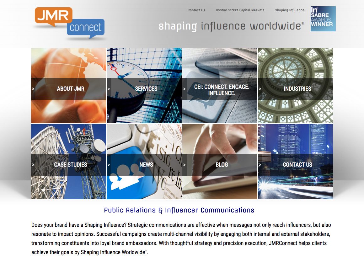
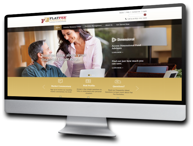
Pages Grid Design
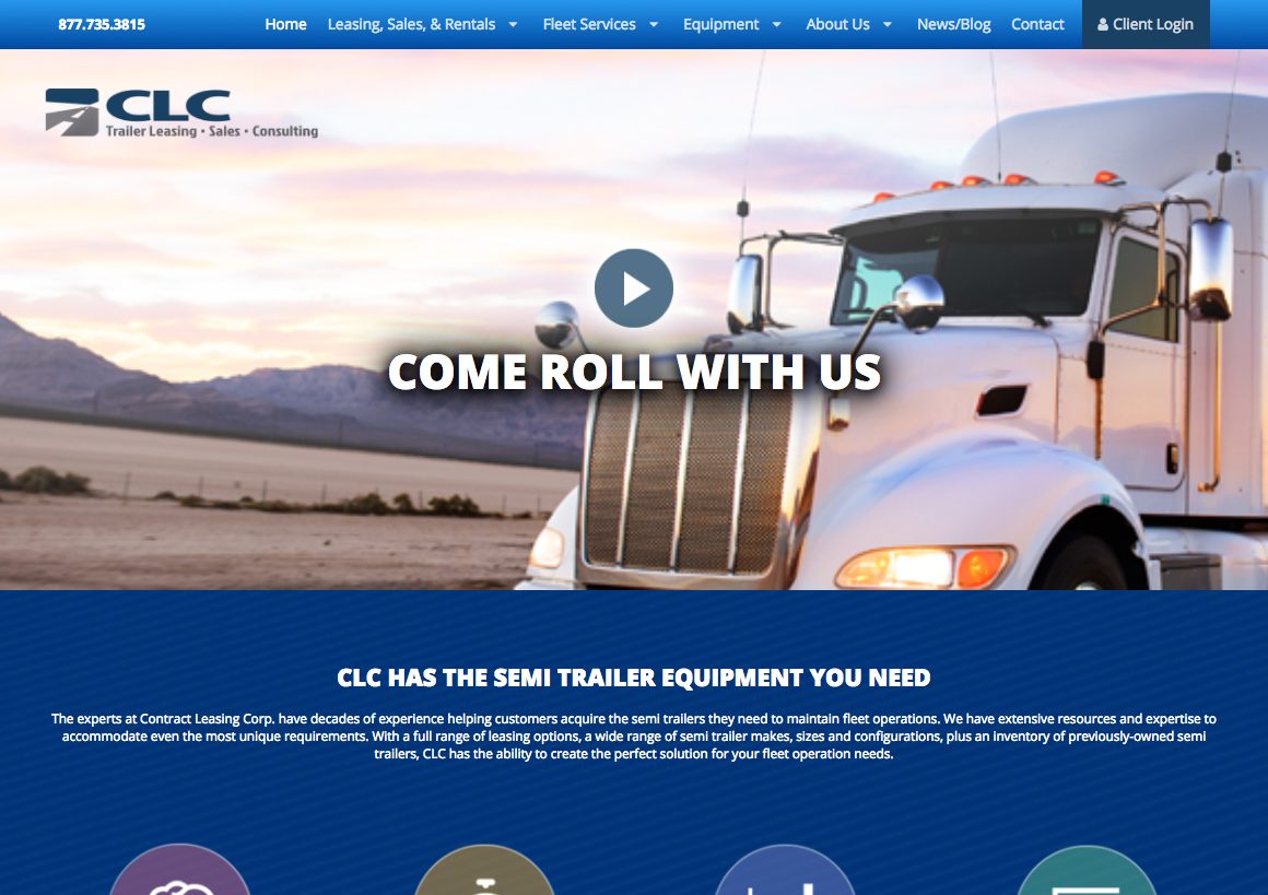
Playable Video Design
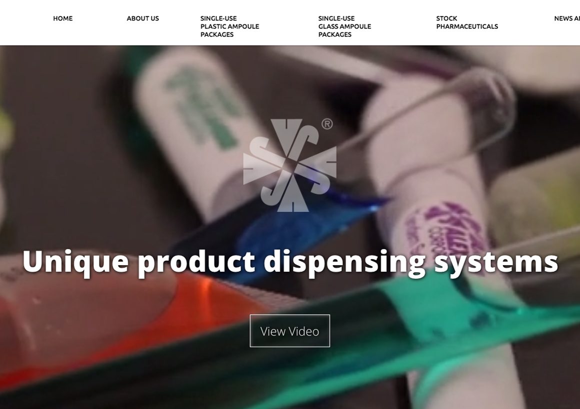
Background Video Player Design

Background Video Player Design

Pages Grid Design

Static Background Photo Design
Need a Hand?
This is all easier said than done… and most importantly, done well. Slideshow or not, your site won't be as effective as it could be without a well-executed, sound strategy behind its architecture. And that just so happens to be our specialty. So feel free to reach out to us to brainstorm some great ideas that will result in both web design and SEO results that you can be proud of!
Modern Website Homepage Redesign
From only $500*
Is it time for your site to ditch the outdated and un-user-friendly homepage slider? Ascent is now offering a complete homepage makeover using your existing site theme, style and design for less than you'd ever imagine.
Contact us for more details and to discuss your unique needs!
[rpt name="homepage-makeover-pricing"]
*Customizations not included in unit price. Any customizations will be quoted separately.